Photo credit: https://flic.kr/p/7R6ZER
microcontent
Small groups of words that can be skimmed by a person to get a clear idea of the content of a web page or email
Email microcontent is the small stuff in your email, the little things like Alt Text and Preheaders that are easy to miss, skip, or gloss over.
Don’t do that. Mind your microcontent. Here’s why.
Microcontent can’t make up for bad main content, but well crafted microcontent can add up to success in your email. These pieces can get more people to open your email, key in on calls-to-action and important messages, and CLICK!
In other words, ALL THE IMPORTANT STUFF.
Some of these are must-haves. Others are simply good ideas. Master them all to rule your email domain.
1. SUBJECT LINE
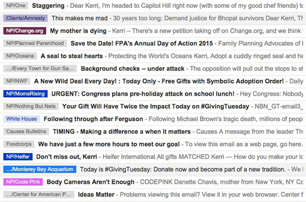
Which one of these emails would you open?
OK, Captain Obvious, we knew this! Yes, you did. Hear me out.
The subject line is one of three pieces of frontline microcontent that determine if an email gets opened. (See #2 and #3 on this list for the others.) If a subscriber does not think your subject line is worthy, nothing else matters. Your email is dead.
My advice? Never, ever just write one email subject line. Even a simple word switch can make a dramatic improvement in your open rate. The folks at Upworthy have to crap out 25 headlines for every piece of content. Should you? Nah. Somewhere between 5 and 25 is your goal.
And know this: you will write crappy subject lines. A lot of them. But this is the process that produces gems, so don’t skip it. That last subject line you eek out might be your salvation.
2. SENDER NAME
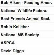
Do you trust these people?
Who is your email from? A real person or simply your organization? Perhaps a combination? Either way, sender name conveys trust, and is the second piece of frontline content that determines if your email gets opened. Make sure it’s as strong as it can be.
Is one method better than another – org, real person name + org, or just real person name? Depends. Your mileage may vary. The only way you’ll know is to test.
Can you change up sender name from time to time? If you’re introducing a new voice — a first person celebrity fundraising appeal for example — yes, change it up. Just don’t switch sender name without purpose (improving open or response rates, or establishing authority).
3. PREHEADER

Give subscribers a sneak peak with your preheader.
You know that small bit of copy at the top of your email, that often appears in the preview of the email? It usually says something like this:
“To view this email on the web, go here.”
The preheader is the third piece of frontline content that determines if your email gets opened. Think of it your email’s sneak peek. And to be frank, it’s usually as exciting as a doorstop.
Why leave such a valuable piece of real estate to an administrative message, especially when it’s totally customizable?
Lure me in. Get me to open. Get me to click.
4. ALT TEXT

Are you using your alt text to its maximum potential?
Alt text is text that shows when a photo doesn’t load, either because it’s blocked or it hasn’t loaded yet. How often have you filled out the alt-text field with a bland file description?
BORING! This is another missed messaging opportunity. Why is that? A huge chunk of email clients block images by default. That’s right, that image you so carefully chose, cropped and placed in the email never shows up. Strong alt text is your back-up plan, your block-image salvation.
Never miss this opportunity again! Write an active alt text. Make a call to action, or ask me to turn on images to see your fancy infographic.
5. HEADER & SUBHEAD
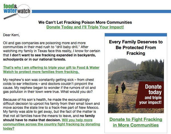
Does your headline and subhead pull you in and inspire you to act?
Headlines distill, inspire, entice. Most subscribers are scanners, so we’re in the business of catching eyeballs and attention. A well designed (big, bold) and well written headline does exactly that.
6. CALL TO ACTION
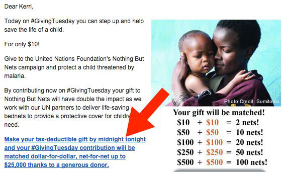
Is your call to action a can’t-miss feature of your email?
Your call to action is there to provoke a specific and immediate response – a click! Make sure readers can see it and click on it, especially with fat thumbs on a mobile phone!
Hyperlink several words, preferably one whole sentence or more. In advocacy and fundraising emails, make at least 2 calls to action.
7. CAPTION/SIDEBAR
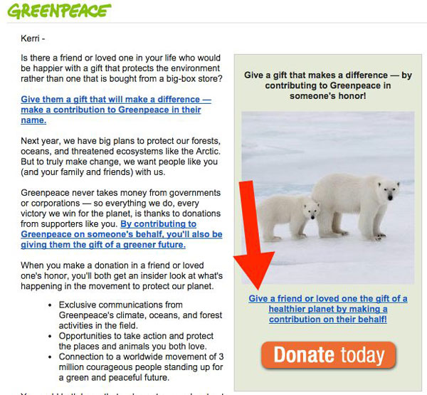
Does your sidebar do this?
Are you using a sidebar or right column in your email? People scan and read little bits of copy like the sidebar and photo captions. Don’t give this copy short shrift! Make it compelling. Make it work!
8. P.S.

To P.S. or not to P.S.? That is the question. ANSWER: Occasionally for fundraising.
Is the P.S. old school or still working? I say, still working, use strategically, mostly for fundraising emails, and always with a call to action.


