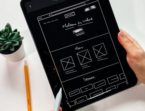
If you have been with us for a while, you know we just finished a HUGE website redesign. (If you are new here, then “Hello!”)
We spent a good chunk of 2020 and into this year researching design trends, best practices, and the latest website bells and whistles.
I already shared some Graphic Design Trends for 2021, but here are the top features your nonprofit website MUST have:
Mobile Friendly (or Responsive) Design
As I mentioned in Monday’s breakdown of the 2021 M+R Benchmarks Study, half of website visits came from mobile users so it better look good on a phone or tablet.
Compelling Copy
Why should people care about your cause? What makes it different from other nonprofits with the same mission? What impact are you having?
Show your website visitors what the problem is, your solution to that problem, and how they can become part of that solution.
Clear Calls to Action
One thing we really worked on when we redesigned our website was making sure new visitors had a path to follow. This meant we picked the one thing we really wanted them to do and featured that. In our case we wanted you to take a two-question quiz to get started with a professional development plan. So our homepage and footer has various “Get Started” buttons.
We then have various other calls to action on different landing pages:
- Register
- Subscribe
- Sign Up
- Download
What do you you want your visitors to do? Donate, volunteer, become a member? All of the above?
You can use various landing pages like we do, but we suggest highlighting the CTA most important to you on your homepage and in your navigation bar (for most nonprofits that will be the “donate” button). Then use different landing pages for other actions.
Email Subscription Form/Box
While this is another call to action, you need to have a option for visitors to stay in touch with you before they decide to follow through on the more prohibitive CTAs like donating or giving.
This form should be simple and only collect the information you need. Often a name and email are enough.
Other Important Features
- Accessibility
- Easy Navigation Menu
- Blog (or some type of system for publishing content housed on your site)
- Social Media Links
- Online Newsroom
- About Us
- Financials
What did I miss? What do you think every website should include?
If you just went through a website redesign, we’d love to feature your project. Send me an email or share in the comments below.


