Is it time to refresh your nonprofit’s email newsletter? We recently shared our seven tips for modern nonprofit email newsletter designs.
Today, let’s look at five email newsletter trends that will influence the way your nonprofit’s e-newsletter looks in the future.
1. Movement at the Top
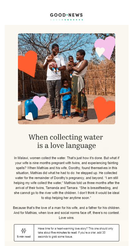
We all know the power of video and animated content. It’s everywhere. So why not at the top of your e-newsletter too?
Here’s an example from Charity: Water.
You can easily make animated gifs from still photos or graphics using tools like Canva or by inserting just a few seconds from a video you are highlighting.

2. Video Newsletters
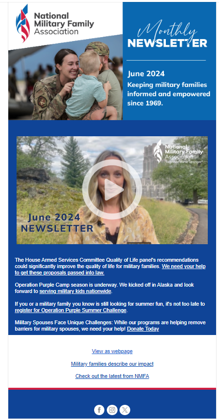
Why not go all in with video and deliver the newsletter content itself that way? The National Military Family Association does a monthly video newsletter with a very brief text summary. While we don’t see a ton of these, we think it’s a great email newsletter trend. If you can’t pull it off, at least try to add movement at the top.
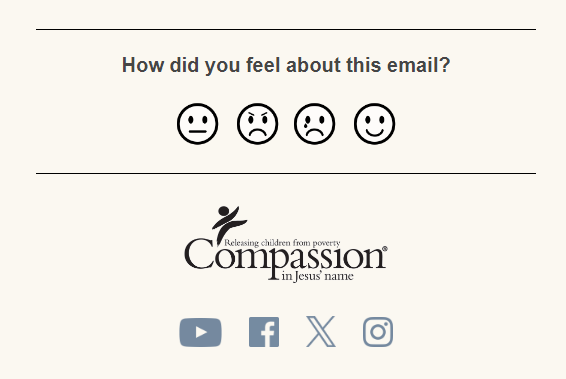
3. Seeking Feedback in the Footer
We all want to know how the folks on our mailing lists are perceiving our work. Why not ask?
Placing a section in your newsletter footer is another email newsletter trend we love, as Compassion International does. Each icon takes you to a landing page. You can include a form there to collect additional data or just acknowledge the feedback. If you are technically savvy enough, you could also pass this information (which icon they clicked on) into your CRM as another data point about the individuals on your list who do click.
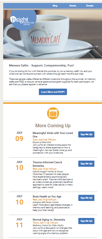
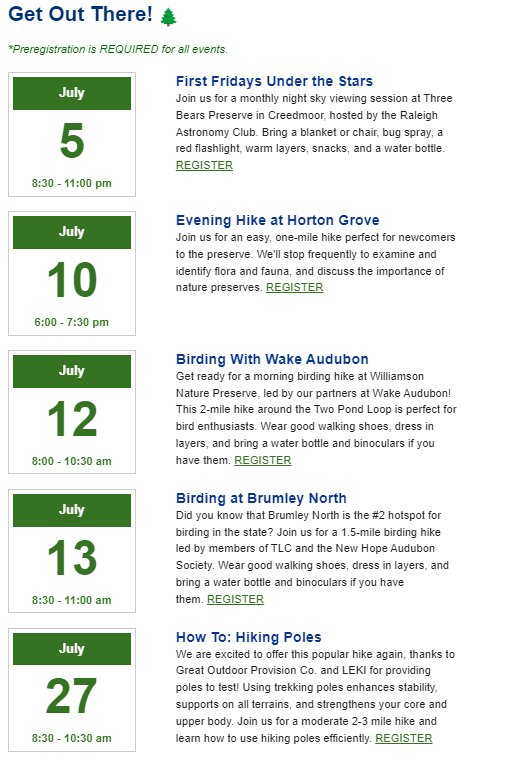
4. Cleaner Event Marketing
Nonprofits market a lot of events. Like a lot.
All of those details can really clutter up an email and make it very hard to skim.
I love the more visually oriented calendar approaches taken by Insight Memory Care Center and the Triangle Land Conservancy.
We really hope this trend catches on in the sector!
5. Conditional Content to Increase Personalization
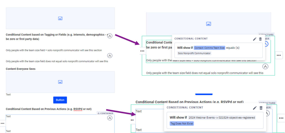
The biggest email newsletter trend of all? Using conditional content to personalize newsletters to each person on your list based on what you know about them.
We’ll share much more about using conditional content as it becomes more universally available in email marketing software, but here’s the basic idea.
Conditional content lets you either show or hide content that will appear in each person’s version of your newsletter in their inbox. As you build the newsletter, you set the rules determining who will see what chunks of content.
So, you could show event marketing to people who have not RSVPd for the event yet, but suppress it or show attendee-only content to those who have.
If you know certain folks like cats and others like dogs because you have them tagged in your CRM, you can show cat images to cat people and dog images to dog people (or whatever makes sense given the topics you work on).
It will look like a bit of a mess on your end because you are adding ALL of the content in the version that you build. But when it is delivered to inboxes, it will look right. We highly recommend testing the variations before sending them!
We would love to see how you are implementing these trends in your nonprofit newsletters!
