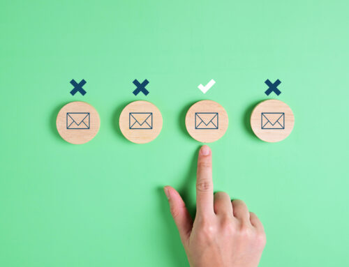
I always advise nonprofits to include photos in their print newsletters. But what about images in e-newsletters? The answer is not as clear-cut and here’s why: a large portion of your online readers probably won’t see the images automatically. Worse yet, if you don’t watch your design carefully, these readers may see only a big empty box leading them to quickly delete your email without a second thought. You can learn more about why this is the case at Campaign Monitor and EmailExperience.org.
Given this reality, I say you should play it safe with your email campaigns and e-newsletters and assume that some portion of readers won’t see your images. That doesn’t mean you shouldn’t include images; it means you should do so carefully. Here are a few guidelines you should follow.
1. Use small images. You don’t want to fill up the viewing pane with an image. Try to keep images under 200 pixels wide. If you use a banner image across the top as a nameplate, keep the height small (under 75 pixels). This will leave you room for your text to appear in the viewing pane.
2. Include great copy as close to the top as possible. Put some extra effort into the text that appears at the top of the message or newsletter. You need to grab your reader with those few words they will see in the preview pane if you are losing some of that space to a blocked image.
3. Always use the ALT tag. When you insert an image in HTML, you have the option of attaching words to that image with an ALT tag. Though it’s not a 100% solution, most readers will see this text even if the image is blocked. (More tips on writing good ALT text tomorrow).
4. Include captions. To keep a caption with your image in an HTML email, create a small table with one column that is the same width as your image and two rows. Put the image in the top row and put the caption in the bottom row. Insert the whole table (image and caption) into your email wherever you want it to appear.
5. Never send image-only messages. I’ve seen event invitations sent via email that are nothing but one solid image. With images off, I see nothing but a big empty box. Bad idea. Never use this approach. Always include text in your emails.


